Review: Daredevil #111

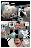
Daredevil #111 features the new story arc from writer Ed Brubaker and the new art team Clay Mann and Stefano Guadiano. After the events in the last arc, this issue opens up with Matt helping Dakota North find some relief for her injured shoulder through the healing hands of the Iron Fist himself, Danny Rand. Unbeknownst to the pair, they are being watched from above by a mysterious new villain who has taken a special affinity to one of Daredevils oldest and deadliest foes. Meanwhile, Matt finds some new trouble to throw onto his ever increasing pile of worry in a shocking surprise that really threw me for a loop!

I thought Ed Brubaker delivered a home run with this issue! The issue doesn’t feature much action, but I thought there were some fantastic moments between the players. The dialog was terrific and very believable. The surprise I mentioned above, and I’m not going to reveal it here, felt very real and didn’t feel forced and I loved Matt’s reaction to it all. I’m really looking forward to seeing the new villain, Lady Bullseye, in action. We get a brief glimpse into her origin and I can’t wait to see how Brubaker uses her in this story!

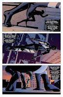
The art from the team of penciler Clay Mann and inker Stefano Guadiano was absolutely fantastic! I thought it fit in very well with what Michael Lark has been doing, and at times I found myself liking it even more. This is the first time I can remember reading a Daredevil issue and thinking Dakota North looks hot! Clay Mann is an artist I’m definately going to start keeping an eye on!

In all, this was a excellent start to this new arc! I’m absolutely loving what Ed Brubaker has been doing with this book, and can’t wait to see where he takes Matt next. Plus, if this issue is any indication, we may be getting a very cool teamup in the coming months. I highly recommend checking Daredevil #111 out if you haven’t been reading this series!

COVERS BY: MARKO DJURDJEVIC, TERRY DODSON, and DAVID AJA
WRITER: ED BRUBAKER
PENCILS: CLAY MANN
INKS: STEFANO GAUDIANO
COLORED BY: MATT HOLLINGSWORTH
LETTERED BY: CHRIS ELIOPOULOS
EDITOR: WARREN SIMONS
Rated T+ …$2.99

To find a comic shop near you, call 1-888-comicbook

Review: X-Force #7

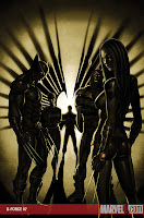
X-Force #7 kicks off the new story arc from series creators Greg Kyle and Christopher Yost. The story focuses on the team as they try and regroup from their battle with Bastion and the Pacifiers. The revived X-men baddies that were revieled in the first arc are starting to make their reappearances around the world and are beginning their mission of spreading mutant hate. The team knows they are soon going to be going after those targets soon, but first they are going to have to deal with an even more dangerous threat!

If your looking for the super bloody, extreme violence and action you got from the last 6 issues, then you might be a little let down with this issue. However, what this story lacked in action I thought it did a great job of putting some more pieces in place that’s looking like will set up for quite a few stories to come for a while. We get some more insight into Angel’s recent change back into Archangel, as well as finding out if Rahne’s able to control herself whenever she see’s Warren. I thought there were some really great moments with Cyclops and Wolverine as Scott tries to figure out what to do with new X-Man Elixir who knows about the secret team after being called in to help heal Rahne in one of the earlier issues. Plus, we get the reappearance of one of the X-Men’s oldest foes. I’m really excited to see where this story goes. It builds upon what has been going on in the last arc, but then takes you in a new direction that I think will be very cool!

New series artist Mike Choi really delivers some solid work with this issue! I’m a fan of Mike Choi to begin with, so when I heard he was going to be doing this book I was pretty fired up. He definitely didn’t let me down! I’m really looking forward to seeing what he does with some big X-Force style action scenes! He draws a very cool Archangel, and since it now appears that he is a permanent member of the team, I can’t wait to see what he does with him in action.

In conclusion, this continues to be a book I’m really enjoying! I’m loving the new art team, and I’m excited to see what the new story arc has in store. If you haven’t checked out X-Force yet, I recommend giving it a shot. This is a great jumping on point!

COVER BY: MIKE CHOI
WRITER: CHRISTOPHER YOST & CRAIG KYLE
PENCILS: MIKE CHOI
COLORED BY: SONIA OBACK
LETTERED BY: VC – CORY PETIT
EDITOR: JOHN BARBER
Parental Advisory …$2.99

To find a comic shop near you, call 1-888-comicbook

Review: The Incredible Hercules #121

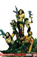
I’m going to be honest. After the Incredible Hulk became the Incredible Hercules, I dropped the title before I really even gave the book a chance. I have never been a huge Hercules fan. I always enjoyed him when he was with the Avengers, but as a solo character he was just never one who particularly interested me. Thus, the reason for dropping the book when the title changed. Over the last few months I have been hearing many people talking about how good the new book is. Well, curiosity finally got the best of me and I can totally see what everybody was talking about! This book was just pure comic book fun! The writing team of Fred Van Lente and Greg Pak deliver an off-the-wall fun ride that was a blast from beginning to end. I love the bits with Amadeus Cho here! World War Hulk kinda left me with a sour taste in my mouth for the character with the whole seventh smartest person in the world line thrown in our face every other panel. But here, he was was a great supporting character with some really funny dialog. The story as a whole, I just really had a good time with. There were great moments of action, a funny historic flashback, a few lessons in speaking ancient Greek and some hot, hormonally charged Amazons with guns! What more could you ask for?

How about some absolutely gorgeous art from Clayton Henry (Wolverine: First Class)! I absolutely loved the art in this book! Henry has a very clean line style that I thought was an excellent fit for this book. There was one scene in particular involving the Titan Atlas that I thought was just amazing! I think Guru-Efx should also get mentioned for their coloring work that helped make that scene so impressive.

In my opinion, this was a really great issue all around! I may have to go do a little back issue bin diving (oh, darn) and try and pull out some of the issues I’ve missed. I give this book two big thumbs up!


COVER BY:ARTHUR SUDYAM
WRITER: FRED VAN LENTE & GREG PAK
PENCILS: CLAYTON HENRY
INKS: CLAYTON HENRY
COLORED BY: GURU-EFX
LETTERED BY: VC – JOE CARAMAGNA
EDITOR: MARK PANICCIA
Rated A …$2.99

To find a comic shop near you, call 1-888-comicbook

Review: NYX: No Way Home #1

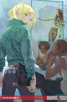
This week in selecting comics to review, I picked books that I would probably not read under normal circumstances. The first book I read was the new Venom mini and I was pleasantly surprised. Next I selected NYX. I had no knowledge of the previous series and had no idea what to expect. Having just finished the first issue, I think I get the general idea. It’s to be about some down on their luck kids with superpowers trying to get by in New York City. And that is where they lost me. I feel fairly certain this book was not written with me as part of its intended demographic; however, it was a professionally done book. Now you’re probably asking yourself if I have to be part of an intended demographic in order to enjoy something. The answer to that is, without a doubt, no. However, based on the way it was written, I’m not sure it’s intended for new readers. There were several times while I was reading that I felt as though the writer was assuming I already felt a connection to these characters, so instead of trying to develop that connection it was glossed over. All the hooks intended to create some kind of connection between reader and story seemed to rely on what has come before. Again, this may have to do with demographics; I’m not a 15-year-old girl living on my own in New York city. The narrator, Kiden, is exactly that. I remember being a 15-year-old boy and thinking 15-year-old girls were great, but now at over twice that age I’m not really that interested in the daily life and culture of the female teen world.

The writer, Marjorie Lui, captured the voice and attitude of a young girl very well, and Kalman Andrasofszky did wonders capturing and showing the body language, facial expressions, and movements of not only of Kiden but all the other people in the story. The way Lui sets up the scenes and moves the plot along is great. The transitions from scene to scene worked well, and there was no point in the story that was bogged down or confusing. Andrasofszky’s art was a high point for me. It was very realistic without going over the top. He didn’t render each hair or fill in every detail, but everything was carefully detailed giving just enough to make everything feel solid and real.

So where does this leave you, the potential reader? Well, if you’re a fan of the previous mini series, pick up this one. I think you’ll be pleased. If you didn’t read the previous series, pick it up only if the premise is interesting to you. However, I would not recommend this book as an impulse buy.

COVERS BY: ALINA URUSOV and JO CHEN
WRITER: MARJORIE LUI
ARTIST: KALMAN ANDRASOFSZKY
COLORS: JOHN RAUCH
LETTERS:JOE CARAMAGNA
EDITOR: JOHN BARBER
Parental Advisory …$3.99

To find a comic shop near you, call 1-888-comicbook

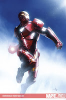
Review: Invincible Iron Man #4

Ezekiel Stane has a grudge. Li’l Zeke blames Tony Stark for the death of his dear old dad, former Iron Man villain Obadiah Stane, aka the Iron Monger. Zeke is making it his life’s mission to bring down Tony Stark as well as the company he has built, and all the while using Tony’s own Iron Man technology to do it. Can Tony stop Ezekiel in time before he destroys Stark Enterprises, as well as bringing down the Iron Man himself?

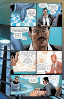
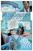
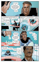
The hunt for Ezekiel Stane continues in issue four of this explosive new series from writer Matt Fraction and artist Salvador Larroca. Fraction continues to deliver a pretty solid story. I wasn’t as thrilled with this issue as I was the previous issues, but I still very much enjoyed it. The only problem I had story wise with this issue was that it seemed to slow down considerably compared to the other three. I was looking for more of the explosions, chases and action that made the first three issues a blast. Don’t get me wrong though, there are some really great moments in this issue. I loved the interaction of Tony and Maria Hill. I think Fraction has a really great grasp of both of these characters, especially Maria. And, being a big fan of chess, I loved the opening with Tony and Reed Richards playing chess on five boards simultaneously. Really, really good stuff there!

I would have to say my biggest problem with the book comes from the art. I don’t want to sound like I’m bashing Larroca’s work. I have always enjoyed his stuff in the past, especially when he was on Extreme X-Men. But his stuff in this issue just didn’t really hit with me. I thought his first three issues were much, much stronger. There were some moments with the some of the characters that I thought just didn’t look right to me, especially the scenes with Reed. Overall, it was still a good read. I would have liked a little bit more action, but their were some really great character moments that made up for it. If you haven’t checked this series out yet, it’s definitely worth giving a shot!

WRITER: MATT FRACTION
ARTIST: SALVADOR LARROCA
COLORS: FRANK D’ARMATA
LETTERS: CHRIS ELIOPOULOS
EDITOR: WARREN SIMONS
Rated A …$2.99

To find a comic shop near you, call 1-888-comicbook

Review: Venom: Dark Origin #1

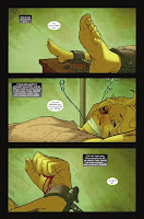
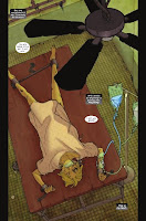
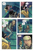
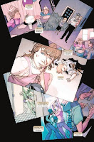
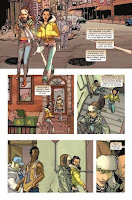
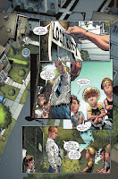
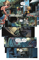
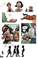
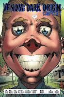
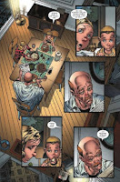
Yeah, okay, where to start? I guess, as Eddie Brock would want, with the truth. I hadn’t intended to read this series. I’m not a fan of Venom. Now I’ve enjoyed his appearances over the years in Spider-Man, but have never picked up any of the series focusing on him. This was going to be no different, to my mind. Of all the titles coming out on August 6th, I’m not even sure why I decided to read this one first, but I did and I’m glad of it. This first issue is not dedicated to the origin of Venom, but rather focuses solely on Eddie Brock. Let me just say this, by the second page I had decided that Brock was waaaayyy more messed up then I ever imagined. I always saw him as a guy who made some bad choices and that his erratic/psychotic behavior was a result of his bond with the symbiote. Evidently this is not even remotely the case. This issue shows Brock’s life from elementary age up to college. We only see little snippets, but they are very telling. Within the first few pages, pages that are previewed here for you, there is an implication that Eddie Brock may have shown some early indications that he was a serial killer in the making. Or perhaps a spree killer.

Zeb Wells does an excellent job of creating interest in a character you thought you already knew. Usually, when reading a comic, or any bit of fiction really, there is the hope for some surprise twist in the story, something you didn’t see coming. The interesting thing about this story is I didn’t see the tone or direction of this story coming. Perhaps I should have, though, because it makes perfect sense. Eddie Brock becomes a much more interesting and compelling character. The question this all raises in my mind concerns the morality that played a fairly important role in Venom’s attitude toward protecting innocents. As I’ve said I’m no Venom scholar, and my recollection is vague, but I always thought his goal was to kill Spider-Man and protect the innocents. Wells may be intending to change things up a bit. I’m very interested to see where he goes from here.

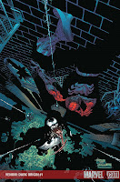
The art on the book was excellent. I’ve always associated Angel Medina with Spawn, a character created by Todd McFarlane, so it seems a natural fit for him to be working on Venom, another McFarlane creation. Well, partially created by McFarlane. Anyway, the art matches the tone of the story wonderfully. It is a very detailed, but strongly cartoon based style with great use of cross-hatching, contrast, angles and perspective. The inker for Medina is Scott Hanna and colorist is Matt Milla. These three work seamlessly together. I would love to see the work at each stage to really get a feel for what each artist added to each page.

Venom: Dark Origin #1 was an interesting read, adding a great deal to a character who’s been around for quite awhile. The great thing about it is you don’t have to be a fan of Venom or Eddie Brock, you don’t have to be reading Spider-Man, or even have any knowledge of either character, really, to enjoy this book. It’s really an excellent introduction to the character. For long time fans, this starts at the beginning before Eddie Brock was Venom, so I think it’s safe to say, you’ll want to read this, too.

Surprisingly, recommended for any fan of Marvel comics.

COVER BY: ANGEL MEDINA
WRITER: ZEB WELLS
PENCILS: ANGEL MEDINA
INKS: SCOTT HANNA
COLORS: MATT MILLA
LETTERS: JOE CARAMAGNA
EDITOR: ALEJANDRO ARBONA

To find a comic shop near you, call 1-888-comicbook

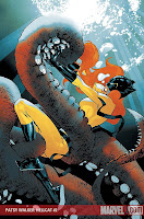
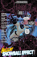
Review: Patsy Walker: Hellcat #2

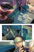
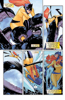
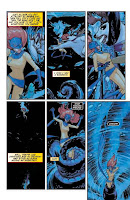
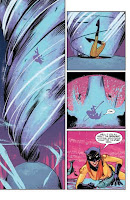
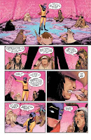
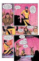
Her first day on her new job and Pasty Walker is already on thin ice. Actually, it’s kinda more like through the ice. After being attacked by a giant squid monster and dragged into icy Alaskan waters at the end of the first issue, Hellcat now finds herself in the company of a group of Shamans who inhabit the Middle World. The Shamans charge Hellcat with the task of finding their heir, who has apparently been kidnapped by the cannibalistic Windigo. Is the feisty Hellcat up to the task? You better believe it!

This series continues to be just a fun, kinetic read! I found this issue to be a little hard to figure out what was going on in certain spots, but it was such a fun story that I was able to look past it. Writer Kathryn Immonen does a great job of delivering a story that is keeping me interested in what’s going to happen next. And David Lafuenta’s art is not too bad either! His style is a perfect fit for this type of book and really adds to the fun, lightheartedness of it.

Hellcat is a character I’ve never been familiar with so this has been my first exposure to her. Immonen has done a great job of getting me interested in this character and wanting to find out more about her. I’m not sure how this version of Hellcat compares to the one that was in the old Avengers series, but I’m definitely going to be looking up some of her old stories! If you haven’t given this book a shot yet, I highly recommend picking it up and giving it a try!

COVER: STUART IMMONEN
WRITER: KATHRYN IMMONEN
ARTIST: DAVID LAFUENTE
COLORS: JOHN RAUCH
LETTERS: DAVE AND NATALIE LANPHEAR
EDITOR: NICK LOWE
Rated A …$2.99

To find a comic shop near you, call 1-888-comicbook

Review: Ms. Marvel #29

I haven’t really been following this title, and now I’m very, very sorry. I also haven’t been following every tie-in with this event, but I’ve been following some of them and this is one of the few issues that has been entirely in the present. This is what I’ve been looking for in the narrative. Battles against overwhelming odds, chase scenes, and a surprise on the last page to get you ready for the next issue. What more can you ask for?

Brian Reed tells the tale of what happens to Ms. Marvel as one of the only heroes fighting the Skrulls in New York. I don’t know where all the other heroes in the Marvel U are, but I can tell you where the Skrulls are. Well, actually I can’t because they seem to be popping up everywhere, but there are a boatload of them in this issue and Mr. Reed makes it clear that they don’t like Ms. Marvel, or her resistance to their invasion, very much.

Doing a fine job on art, we’ve got Adriana Melo on pencils, Mariah Benes on inks, and Paulo Siqueira on pages 11 – 16. They convey the scale of the invasion and the overwhelming forces the heroes face beautifully. Now, I generally try to keep my reviews on the positive side but I have to interject here that while the art is well done, it doesn’t really do anything for me. These are professional comic book artists who have achieved mastery of their art form, so I don’t want to take away from that, but I didn’t feel that this was the best this book could have or should have looked. That said, the story does move along well and is one of the best tie-ins I’ve read so far.

Recommended for anyone following Secret Invasion.

COVER: GREG HORN
WRITER: BRIAN REED
PENCILS: ADRIANA MELO and PAULO SIQUEIRA
INKS: MARIAH BENES and PAULO SIQUEIRA
COLORS: CHRIS SOTOMAYOR
LETERS: DAVE SHARPE
EDITOR: STEPHEN WACKER
Rated T+ …$2.99

To find a comic shop near you, call 1-888-comicbook

Review: Fantastic Four: True Story #1

When Reed Richards can no longer find solace in the theatrical version of “Josie and the Pussycats”, you know something very serious must be going on! But when the whole world seems to lose it’s love for fiction, some villian must definitely be behind it! Now it’s up to the Fantastic Four, with the help of their old friend Willie Lumpkin, to get to the bottom of the problem. Get ready to take a journey through classic literature with the Fantastic Four as your guides in this all new four part miniseries!

Writer Paul Cornell (Captain Britain and MI:13, Wisdom, TV’s Dr. Who) and artist Horacio Domingues seem to have something really special going on with this series. This book was just a really fun, off the wall experience from start to finish. This is probably unlike any other Fantastic Four book you’ve read before! The story literally finds the FF using their imaginations to get to the bottom of the worlds sudden missing love for fiction. Along the way, the team encounters classic characters throughout literature including Dante (not the one from Clerks) and the Dashwood sisters from Sense and Sensibility. You really feel that Cornell has a great love for the classics with this story. Horacio Domingues’ art is just a blast to look at! His playful style is really a wonderful fit for this book. Just wait till you get a look at the Fictocraft! I would love to see what he could do with Spider-Man. This was just an all around great read that I truly had a blast with and can’t recommend enough!


COVER BY: NIKO HENRICHON

WRITER: PAUL CORNELL

PENCILS: HORACIO DOMINGUES
INKS: HORACIO DOMINGUES
COLORED BY: HORACIO DOMINGUES

LETTERER: DAVE LANPHEAR
EDITOR: TOM BREVOORT
Rated A …$2.99

To find a comic shop near you, call 1-888-comicbook

Review: Black Panther #39

The Skrulls think an invasion of Wakanda will be a walk in the park. But King T’Challa, the Black Panther, and the citizens of Wakanda have other plans! It’s non-stop Secret Invasion excitement as the Skrulls bring the fight to Wakanda’s front door! Black Panther #39 features the new creative team of writer Jason Aaron and artist Jefte Palo. Story wise, I thought this issue was a really good read. I loved the back and forth between the Skrull battleship and the Wakandan command center leading up to a final confrontation at the gates of Wakanda. I really appreciated the insight we get into the motivation of the Skrull Commander leading the Wakandan invasion. For me, it really helped make the battle feel more than just another Skrull attack. You knew the Skrull leading this mission was fighting for a purpose and I felt that really added to the story. Really great writing on Jason Aaron’s part. The art from Jefte Palo was kinda hit or miss for me. There were a couple of splash pages that I thought looked really good, especially some of the battle scenes. But than there were other spots that just didn’t really do anything for me. Overall, this was a really good issue and an excellent tie-in to the Secret Invasion event. There were some really well done battle sequences and the story was well written. This book is definitely worth picking up!

COVER: JASON PEARSON
WRITER: JASON AARON
ARTIST: JEFTE PALO
COLORIST: LEE LOUGHRIDGE
LETTERER: VC’S CORY PETIT
EDITOR: AXEL ALONSO
Rated T+ …$2.99

To find a comic shop near you, call 1-888-comicbook